Data Science & Analytics
Click on a graph to learn more.
Breast Cancer Diagnosis Prediction Using Logistic Regression
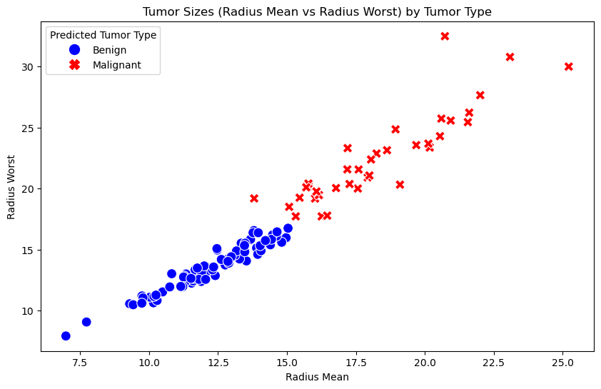
In this project, I used logistic regression to predict whether a breast tumor is benign or malignant based on tumor size features (such as radius_mean and radius_worst). Using the Wisconsin Breast Cancer dataset, I trained and tested the model, performing data cleaning, feature selection, and evaluation. This model can assist healthcare professionals in early cancer detection, potentially leading to quicker, more accurate diagnoses, especially in resource-limited settings.
Technologies Used: Python, pandas, scikit-learn, matplotlib, seaborn
Key Steps:
Visualization: Created box plots and scatter plots to compare tumor sizes and their correlation with tumor type. Data Cleaning & Exploration: Cleaned the dataset, handled missing values, and selected key features for prediction. Model Building: Applied logistic regression to model the relationship between tumor size and diagnosis. Evaluation & Results: Achieved 94.74% accuracy, evaluated performance using sensitivity, specificity, and the confusion matrix.
Maternal Mortality Data
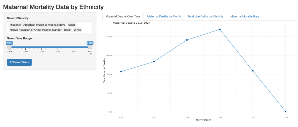
This project investigates racial disparities in maternal mortality rates in the United States, highlighting the significant differences between women of color and white women. Using data from the CDC’s VSRR Provisional Maternal Death Counts and Rates dataset, the analysis reveals that African American and American Indian/Alaska Native women face the highest mortality rates, with rates of 52.2 and 54.9 deaths per 100,000 live births, respectively—more than double the rate for white women (19.0 per 100,000). Women aged 40 and older are also at the highest age-related risk, with a mortality rate of 91.95 per 100,000.
These disparities are driven by systemic inequities such as unequal access to prenatal care, medical biases, and other structural barriers. Despite some efforts to reduce these disparities, persistent trends show minimal improvement, highlighting the urgent need for systemic changes to ensure equitable maternal health outcomes.
Technologies Used: R, ggplot2, Shiny, dplyr
Key Steps:
Data Analysis: Analyzed maternal mortality data from the CDC’s VSRR Provisional Maternal Death Counts. Data Visualization: Used ggplot2 in R to create interactive visualizations to compare mortality rates across different racial groups and age brackets. Shiny App Development: Developed an interactive Shiny app to visualize and explore the disparities in maternal mortality rates dynamically. Insights & Impact: Highlighted the disparities faced by women of color and recommended potential interventions to improve maternal health outcomes.
Stockton University Crime Log
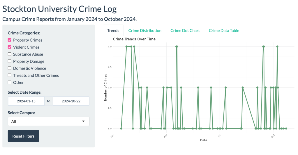
This project visualizes Stockton University’s 2024 crime data, focusing on campus safety trends through an interactive Shiny app. The app allows users to filter crime data by category, timeframe, and campus, offering valuable insights into patterns of criminal activity on campus. Key visualizations include a time series chart, histogram, and dot plot, enabling users to track crime trends over time and by location.
The analysis reveals that violent crimes, such as harassment and simple assault, are the most frequently reported. The data shows that February had the highest number of incidents, highlighting a potential area for further safety interventions.
Technologies Used: R, ggplot2, Shiny, dplyr
Key Steps:
Data Cleaning: Preprocessed and cleaned Stockton University’s 2024 crime data to ensure accuracy and consistency. Data Visualization: Created dynamic and interactive visualizations using ggplot2 and Shiny. Shiny App Development: Developed an interactive Shiny app to allow users to filter crime data by different categories and timeframes, providing easy access to insights. Insights & Impact: Provided actionable insights into campus crime trends to support decision-making in safety initiatives.
You are enough, just as you are.🖤
